1 Sweet Adventure
Hey everyone! I’m super excited to be sharing my first ever project
(and blog post) as part of the Shimmerz Design Team. For my debut, I decided to
get very colorful and push out of my comfort zone a bit. And guess what? I LOVED
IT and most importantly, I LOVED THE LAYOUT! Want to create a messy and sweet project
perfect for documenting sugary adventures? Here’s how I made today’s layout:
In order to better guide you through the process, I’ve divided
it up into 4 sections; (1) cutfile, (2) the backing of the cutfile, (3)
background, and (4) finishing it all off.
1 – Cutfile
When I
saw this ice cream cut file that came in this month’s main color kit, I was
floored! I had been looking for such a cut file to document my sons’ sticky
sweet adventure but hadn’t found one that I liked… until this one! Since I
already had the pictures that I’d be using in mind, it was easy for me to pick
the layout’s color scheme. For the layout, I cut the cut file on some non-textured
Kraft cardstock to give a more muted tone to the colors that I was going to be
adding unto to it. Afterwards, I colored each of individual ice creams,
toppings, and cones. Below you’ll find the colors I used.
1.
Lil’ Yellow School Bus (Coloringz)
2.
Jeni B Bleu (Vibez)
3.
Iris My Case (Shimmerz)
4.
Royal Red (Shimmerz)
5.
Marigold (Shimmerz)
6.
Brass Knuckles (Inklingz)
7.
Penny 4 Your Thoughts (Inklingz)
Once everything was dry, I added 3D tape (or foam adhesive)
to the cut file, set it aside to get working on my next step, the backing of the
cutfile.
2- Backing of the Cut File
On a scrap
piece of white textured cardstock, I made different swatches of yellow,
periwinkle, teal, red, and orange. For some pops of texture, I used a star
stencil with some modeling paste on the periwinkle swatch and used the same
stencil with Shimmerz Dazzlerz Puttin’ On the Glitz on the orange swatch. For
the ombre look of the triple scoop teal ice cream, I used Jenni B Bleu to the
top swatch. For the middle swatch, I mixed a bit of Chance of Rain with Jeni B
Bleu, and finally for the bottom scoop, used a bit more of Chance of Rain with
Jeni B Bleu. These are going to be the pieces that I’ll be using to back the
cut file. On a separate piece of Kraft cardstock, I sprayed some Granny Gray to
give the otherwise matte cardstock some shimmer. Finally, I set everything
aside to dry (and moved on to working on my background). Once everything was
dry, I backed the cut file. Again, you’ll find the colors I used below.
- Tuscan Sun (Spritz)
- Lil’ Yellow School Bus (Coloringz)
- Meet Me @ Sunset (Inklingz)
- Iris My Case (Shimmerz)
- Corney Flower Blue (Inklingz)
- Jeni B Bleu (Vibez)
- Chance of Rain (Spritz)
- Marigold (Shimmerz)
- Just Peachy (Creameez)
- Crimson Tide (Shimmerz)
- 11. Royal Red (Shimmerz)
- Granny Gray (Spritz)
3 – Background
Whenever
I think of ice cream, I think of ice cream dripping down your hand on a warm
summer day. Add 2 toddlers and a very hot day at the Walt Disney World Parks
and you got one big sticky (and memorable) mess! Since I had lots of colors
going on within the cut file itself, I wanted to keep things subtle on the
background while at the same time making the cut file stand out. To remedy that
I used a text patterned paper from Paige Evans’ Horizon collection, covered it
in gesso, and made color “sections” in yellow, periwinkle, teal and orange by
using the packaging technique and a brush for some splatters. I let some of the
color pool in the center of each section and then lifted the background up to
create drips… just like ice cream drips! Once done, I set it aside to dry.
- Tuscan Sun (Spritz)
- Rip Van Periwinkle (Vibez)
- . Jeni B Bleu (Vibez)
- Marigold (Shimmerz)
Since I
had already used some patterned paper from Paige Evans’ Horizon, I gathered a
few scraps of paper from it to back my 2 photos (they are roughly 2.5 x 3.5). I
chose embellishments that matched the color scheme and overall theme of the
layout. These vary between stickers, chipboard, brads, enamel dots, buttons,
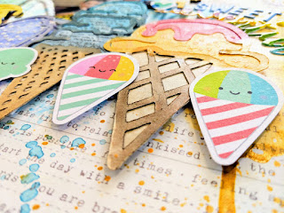
ephemera and puffy shapes. To further add to the cuteness, I found these
adorable ice cream cones from Doodlebug Design and added them to the base of
the cones from the cut file on some 3D foam. My title “1 Sweet Adventure” was
made from a combination of different alphas and thickers.
I loved how this turned out, love the colors! If you liked
any of the colors you saw me use, you can find them all @ Shimmerzpaints.com.
Want a freebie? Write my name in the comments section of
your order to receive some free paint!

Thank you so much for looking and I hope you are inspired to create a layout like this!
- - Lorimar


No comments:
Post a Comment